The Psychology of Color in Business Branding
Color is the first thing people notice and the last thing they forget. Before they read your company name, absorb your tagline, or understand what you sell, they've already felt something about your brand based on color alone.
This isn't opinion. It's neuroscience.
Studies show that color increases brand recognition by up to **80%**, and up to **90% of snap judgments** about products are based on color alone. In a world where you have seconds to make an impression, color is your most powerful tool.
Let's break down the psychology behind color choices in business branding.
How Color Affects the Brain
When we see color, our brains process it before conscious thought kicks in. The limbic system, responsible for emotions and memory, responds to color instantaneously.
This is why certain colors make us feel calm, others make us feel energized, and still others make us feel hungry (hello, red and yellow fast food logos).
These responses are partially biological and partially cultural. While some associations are universal (red = danger/attention across cultures), many are learned through repeated exposure.
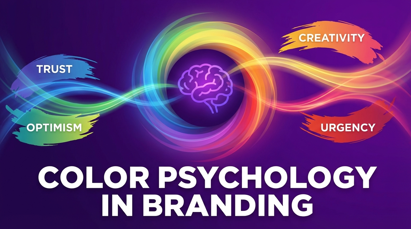
The Color-by-Color Breakdown
Blue: Trust, Professionalism, Calm
**Why it works:** Blue is the most universally liked color and the most common in corporate branding. It evokes reliability, trustworthiness, and professionalism.
**Best for:** Financial services, healthcare, technology, B2B companies, anything requiring trust.
**Examples:** IBM, Facebook, LinkedIn, PayPal, Visa, Intel.
**Caution:** Can feel cold, corporate, or generic when overused without differentiation.
Red: Energy, Urgency, Passion
**Why it works:** Red increases heart rate and creates a sense of urgency. It demands attention and triggers action.
**Best for:** Food and beverage, entertainment, sales/retail, brands wanting to convey excitement or boldness.
**Examples:** Coca-Cola, Netflix, YouTube, Target, Red Bull.
**Caution:** Can feel aggressive or alarming. Works better as an accent than a dominant color for most B2B brands.
Green: Growth, Health, Nature
**Why it works:** Green signals environmental consciousness, health, wealth, and growth. It's calming but also suggests forward movement.
**Best for:** Sustainability brands, health and wellness, finance (money association), organic/natural products.
**Examples:** Whole Foods, Starbucks, Spotify, John Deere, TD Bank.
**Caution:** Can feel passive or blend into backgrounds. Ensure sufficient contrast.
Yellow: Optimism, Warmth, Attention
**Why it works:** Yellow is the first color the eye notices. It evokes happiness, warmth, and energy.
**Best for:** Brands targeting youth, creative industries, attention-grabbing accents, budget-friendly positioning.
**Examples:** McDonald's, IKEA, Best Buy, Snapchat, Post-it.
**Caution:** Can cause visual fatigue in large doses. Often works better as secondary color.
Orange: Creativity, Adventure, Enthusiasm
**Why it works:** Orange combines red's energy with yellow's friendliness. It's playful, creative, and approachable.
**Best for:** Entertainment, food, creative agencies, sports, brands targeting younger demographics.
**Examples:** Nickelodeon, Fanta, SoundCloud, HubSpot, Amazon (smile).
**Caution:** Can feel cheap or unserious in certain contexts. Rarely works for luxury or financial brands.
Purple: Luxury, Creativity, Wisdom
**Why it works:** Historically associated with royalty (purple dye was expensive), it evokes sophistication, creativity, and imagination.
**Best for:** Beauty and cosmetics, luxury goods, creative services, brands targeting women.
**Examples:** Cadbury, Hallmark, Twitch, Yahoo, Wonka.
**Caution:** Can feel too feminine or eccentric for some B2B applications.
Black: Sophistication, Power, Luxury
**Why it works:** Black is authoritative, elegant, and timeless. It creates contrast and suggests premium quality.
**Best for:** Luxury brands, fashion, high-end services, brands wanting to convey exclusivity.
**Examples:** Chanel, Nike, Apple, Prada, Louis Vuitton.
**Caution:** Can feel heavy or uninviting. Requires thoughtful pairing with other colors.
White: Simplicity, Cleanliness, Modern
**Why it works:** White creates space, suggests purity, and feels modern and minimal.
**Best for:** Technology, healthcare, lifestyle brands, minimal/modern aesthetic.
**Examples:** Apple (product design), Tesla, Warby Parker, Google.
**Caution:** Requires strong typography and imagery to avoid feeling empty.
Industry Color Conventions
Certain industries have established color patterns worth understanding:
Finance & Banking
**Dominant:** Blue, green, black
**Why:** Trust, stability, money associations
Healthcare
**Dominant:** Blue, green, white
**Why:** Cleanliness, trust, calm
Food & Beverage
**Dominant:** Red, yellow, orange
**Why:** Appetite stimulation, energy, warmth
Technology
**Dominant:** Blue, white, sometimes bold accent colors
**Why:** Trust, innovation, simplicity
Luxury
**Dominant:** Black, gold, white
**Why:** Sophistication, exclusivity, elegance
Sustainability
**Dominant:** Green, earth tones, blue
**Why:** Nature, environment, trust
Breaking Convention
Understanding conventions is essential, but so is knowing when to break them.
**Standing out in a sea of sameness:** If every competitor uses blue, your purple brand will be memorable.
**Signaling disruption:** Fintech companies often use unexpected colors (bright gradients, bold oranges) to signal they're not traditional banks.
**Repositioning:** A healthcare company using warm yellows instead of clinical blues might attract patients looking for a more personal experience.
The key is intentionality. Break convention because it serves your strategy, not because you didn't know the rules.
Practical Application: Building Your Color Palette
Start with Strategy
Before picking colors, answer:
Choose a Primary Color
Your primary color does the heavy lifting. It should:
Add Secondary and Accent Colors
Build out your palette:
Test in Context
Colors look different on:
Test your palette across real use cases before finalizing.
Color Accessibility
Color choices have accessibility implications:
The FifthBoston Approach
At FifthBoston Media Group, we approach color strategically:
Color isn't decoration. It's one of the most powerful tools in your brand arsenal.
---
*Ready to explore how strategic color choices could transform your brand? [Connect with our team](/contact) for a brand consultation, or [see how we work](/services) with clients on brand identity projects.*
Fifth Boston
Creative agency specializing in brand strategy, design, and digital marketing.