Back to Blog
marketing collateral
conversion optimization
design best practices
marketing design
data-driven design

Marketing Collateral That Actually Converts: A Data-Driven Guide

Fifth BostonDec 30, 20247 min read
Marketing Collateral That Actually Converts: A Data-Driven Guide

Marketing collateral is only as valuable as the actions it drives. A beautiful brochure that doesn't generate leads is expensive decoration. An ugly email that converts at 10% is a business asset.

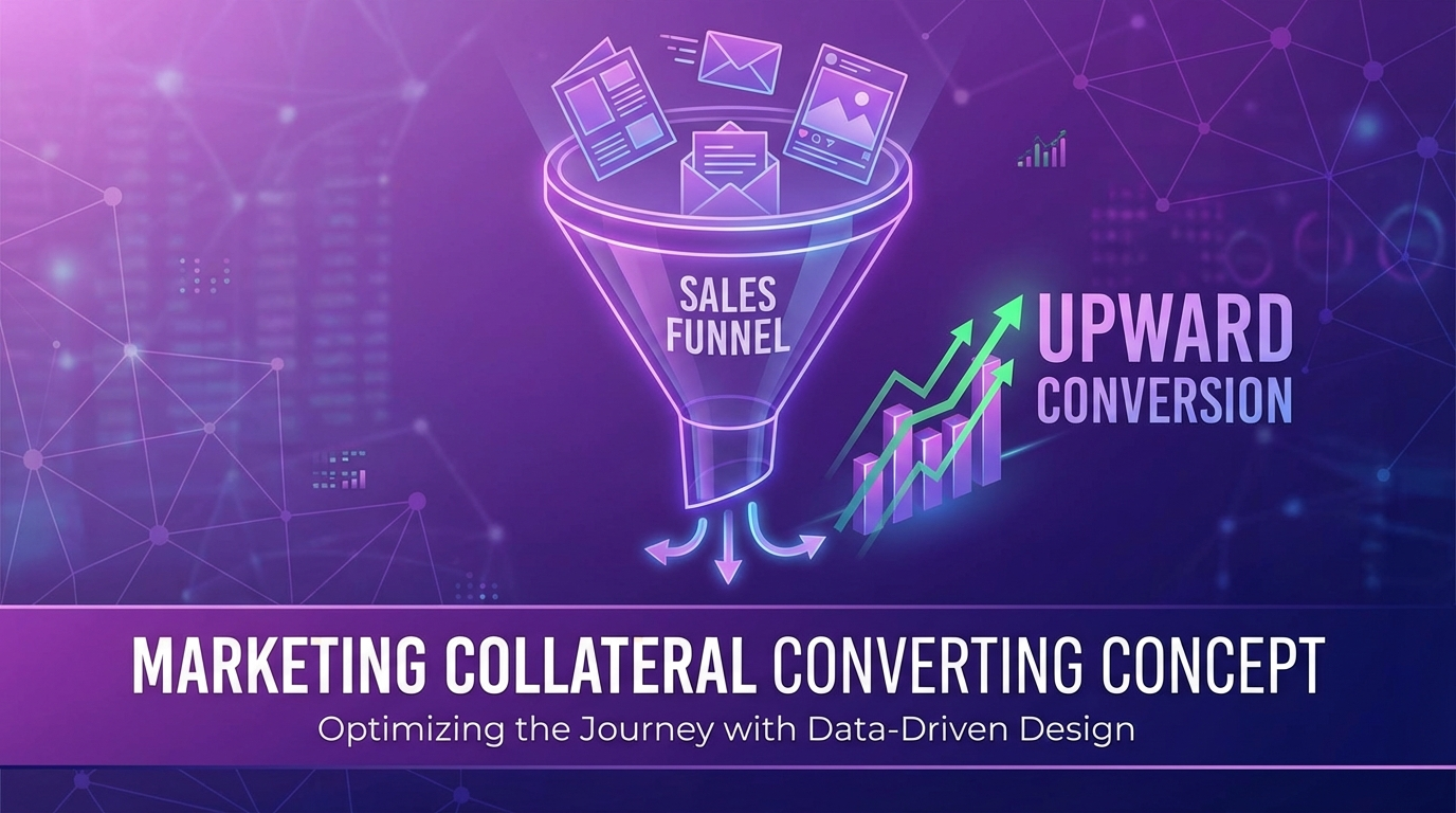
Let's look at what actually makes collateral perform, and how to apply these principles to your materials.

The Conversion Hierarchy

Before diving into tactics, let's establish a framework. Marketing collateral serves different roles in the customer journey:

Awareness Stage

**Goal:** Capture attention, spark interest

**Formats:** Social ads, display banners, social posts

**Key metric:** Click-through rate, engagement rate

Consideration Stage

**Goal:** Educate, build credibility

**Formats:** Case studies, whitepapers, comparison guides

**Key metric:** Time on page, download rate, scroll depth

Decision Stage

**Goal:** Overcome objections, drive action

**Formats:** Proposals, pricing sheets, testimonial compilations

**Key metric:** Conversion rate, sales velocity

Each stage requires different design strategies. Optimizing a case study for click-through (wrong metric) or a social ad for time-on-page (wrong metric) leads to underperformance.

Data-Driven Design Principles

Here's what research and testing consistently shows about high-converting collateral:

1. Visual Hierarchy Drives Understanding

Eye-tracking studies show users scan content in predictable patterns:

  • **F-pattern** for text-heavy pages (read top, scan left side)
  • **Z-pattern** for image-heavy layouts (top-left to top-right to bottom)
  • **Focal point** patterns for single-message designs
  • Application:

  • Place most important message where eyes land first
  • Use size, contrast, and color to guide attention
  • Don't fight natural reading patterns, work with them
  • **Data point:** Content with clear visual hierarchy sees **47% higher comprehension** than cluttered alternatives.

    2. White Space Increases Retention

    Counterintuitively, less content often means more impact. White space (negative space) around elements:

  • Draws attention to what remains
  • Reduces cognitive load
  • Increases perceived quality
  • Improves readability
  • Application:

  • Increase margins and padding
  • Limit content per page/slide
  • Let key messages breathe
  • Resist the urge to fill every inch
  • **Data point:** Layouts with appropriate white space show **20% higher comprehension** of key messages.

    3. Specific Numbers Outperform Vague Claims

    "Significantly improved results" vs. "47% increase in conversion rates"

    Which is more credible? Which is more memorable?

    Specific numbers:

  • Feel more authentic (even if harder to verify)
  • Are easier to remember and repeat
  • Create concrete mental anchors
  • Suggest rigorous measurement
  • Application:

  • Replace vague adjectives with specific metrics
  • Use odd numbers (they feel more authentic than rounded)
  • Include context ("47% increase" vs. "47% increase over industry average")
  • Cite timeframes ("in 90 days" vs. "in our experience")
  • **Data point:** Headlines with numbers receive **36% higher click-through** than headlines without.

    4. Social Proof Reduces Friction

    Humans are social creatures. We look to others' behavior when making decisions, especially uncertain ones.

    Effective social proof formats:

  • **Testimonials:** Real words from real customers
  • **Logos:** Recognizable brands you've served
  • **Statistics:** "10,000+ companies trust us"
  • **Case studies:** Detailed success stories
  • **Reviews/ratings:** Third-party validation
  • Application:

  • Include social proof on every high-stakes page
  • Use photos with testimonials (increases credibility 35%)
  • Choose testimonials that address specific objections
  • Place social proof near conversion points
  • **Data point:** Adding social proof increases conversion rates by an average of **15%**.

    5. One Clear CTA Outperforms Multiple Options

    The paradox of choice: more options lead to fewer decisions. Every CTA you add competes for attention and creates decision paralysis.

    Application:

  • One primary CTA per page/asset
  • Secondary CTAs should be visually subordinate
  • CTA copy should be specific ("Get Your Free Audit" not "Submit")
  • Button color should contrast with surroundings
  • **Data point:** Pages with a single CTA see **371% higher clicks** than pages with multiple competing CTAs.

    6. Benefit-First Headlines Win

    Features describe what something is. Benefits describe what it does for the reader.

  • **Feature:** "AI-powered analytics dashboard"
  • **Benefit:** "See exactly which campaigns drive revenue"
  • Headlines should answer the reader's implicit question: "What's in it for me?"

    Application:

  • Lead with the outcome, not the mechanism
  • Use "you" language over "we" language
  • Address the reader's goals, not your capabilities
  • Save features for supporting copy
  • **Data point:** Benefit-focused headlines outperform feature-focused headlines by **4x** on average.

    Format-Specific Best Practices

    Social Media Graphics

    What works:

  • Bold, legible text (minimum 30pt for mobile)
  • High contrast for scroll-stopping
  • Faces (human images get 38% more engagement)
  • Odd numbers in statistics
  • Questions that provoke engagement
  • What doesn't:

  • Cluttered compositions
  • Small text requiring zoom
  • Stock photos that feel generic
  • Too much brand messaging
  • **Benchmark:** Top-performing social graphics achieve 3-6% engagement rates.

    Email Templates

    What works:

  • Personal sender names (not "noreply@")
  • Benefit-driven subject lines (not clever/cute)
  • Single-column layouts for mobile
  • Clear visual hierarchy
  • One primary CTA above the fold
  • What doesn't:

  • Image-heavy designs (many clients block images)
  • Multiple competing offers
  • Long paragraphs of text
  • Vague CTAs ("Click Here")
  • **Benchmark:** B2B email averages 2.5% click-through; top performers hit 5%+.

    Sales Presentations

    What works:

  • One idea per slide
  • Visual support for verbal delivery
  • Consistent design language
  • Strategic use of animation
  • Clear next-step ending
  • What doesn't:

  • Text-heavy slides
  • Reading slides aloud
  • Inconsistent formatting
  • Ending without CTA
  • **Benchmark:** Presentations with visual consistency score 33% higher in audience recall tests.

    Case Studies

    What works:

  • Clear before/after structure
  • Specific metrics and results
  • Client quotes for authenticity
  • Recognizable company names
  • Scannable formatting
  • What doesn't:

  • Vague success claims
  • Missing customer voice
  • Dense paragraphs
  • No visual hierarchy
  • **Benchmark:** Case studies with specific metrics convert 22% better than generic success stories.

    Proposals and Pricing

    What works:

  • Custom covers with client name
  • Executive summary upfront
  • Clear pricing presentation
  • Next steps spelled out
  • Professional polish throughout
  • What doesn't:

  • Generic template feel
  • Buried pricing
  • Jargon-heavy language
  • Unclear scope definitions
  • **Benchmark:** Customized proposals close 68% more frequently than template proposals.

    The Testing Mindset

    The best marketers treat every piece of collateral as a hypothesis to test:

    A/B Test Headlines

    Small changes in headline copy can yield large performance differences. Test:

  • Benefit vs. feature framing
  • Question vs. statement
  • Specific numbers vs. general claims
  • Short vs. long
  • Test Visual Approaches

    For key assets, develop 2-3 visual directions and let data decide:

  • Image-heavy vs. text-focused
  • Bold colors vs. subtle palette
  • Lifestyle imagery vs. product shots
  • Illustrated vs. photographic
  • Iterate Based on Results

    Collateral should evolve based on performance:

  • Kill underperformers quickly
  • Double down on what works
  • Test variations of winners
  • Document learnings for future projects
  • Making It Actionable

    Here's how to apply these insights to your next project:

    Pre-Design Checklist

  • [ ] What stage of the journey is this for?
  • [ ] What specific action should viewers take?
  • [ ] What's the key benefit to communicate?
  • [ ] What objection might prevent action?
  • [ ] What social proof is available?
  • Design Review Checklist

  • [ ] Is visual hierarchy clear?
  • [ ] Is there adequate white space?
  • [ ] Are claims specific and credible?
  • [ ] Is there social proof visible?
  • [ ] Is there one clear CTA?
  • [ ] Does the headline lead with benefit?
  • Post-Launch Checklist

  • [ ] What metrics will measure success?
  • [ ] When will performance be reviewed?
  • [ ] What variations could be tested?
  • [ ] What did this teach us for next time?
  • ---

    *Need help creating collateral that converts? Our team at FifthBoston Media Group designs for results, not awards. [See how we work](/services) or [get in touch](/contact) to discuss your goals.*

    FB

    Fifth Boston

    Creative agency specializing in brand strategy, design, and digital marketing.

    Ready to elevate your brand?

    Let's discuss how we can help bring your vision to life.

    Marketing Collateral That Actually Converts: A Data-Driven Guide | FifthBostonMedia Blog | FifthBostonMedia